


First of all, thanks to a parent’s enquiry on Griftergram ( oh, sorry, did I spell that wrong?) I went digging in my archive of Ancient Portfolio Gubbins to look for the visual prompts I may have used when writing my Pure Dead series of six novels for older readers. Where did I find visual inspiration for the main characters?
Where indeed? In truth, I made them up - of course I did, but like a human meat-grinder, I constructed my sausage people ( here we go, yet another carefully-crafted mangled metaphor) out of the bits and pieces I’d gathered from Life Inc. along the way. I deliberately didn’t describe a single physical characteristic of any of my characters to ensure that a child reader might be able to recognise themselves in the characters in my book without tripping up over details like skin colour, hair colour, weight, height etc. But while I was engaged in the many years of writing about my beloved Strega-Borgias, I did occasionally get a glimpse of what they looked like.
Is this weird? Do other writers ‘see’ their made-up characters as they’re trying to breathe life into their pages? For me, it was more like radio than television. I could hear them, sometimes clearly, sometimes I’d be lip-reading… except, of course, without lips.
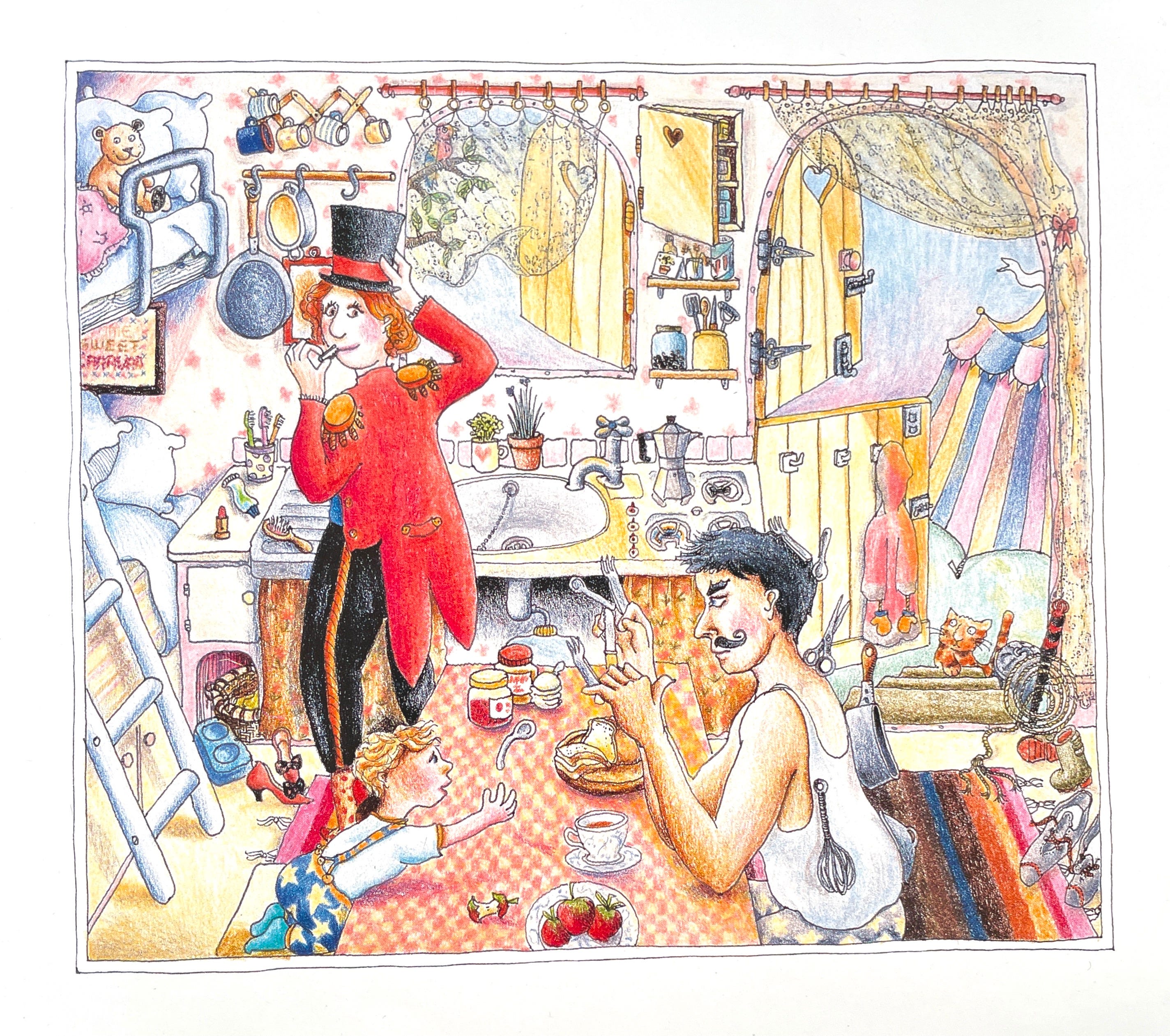
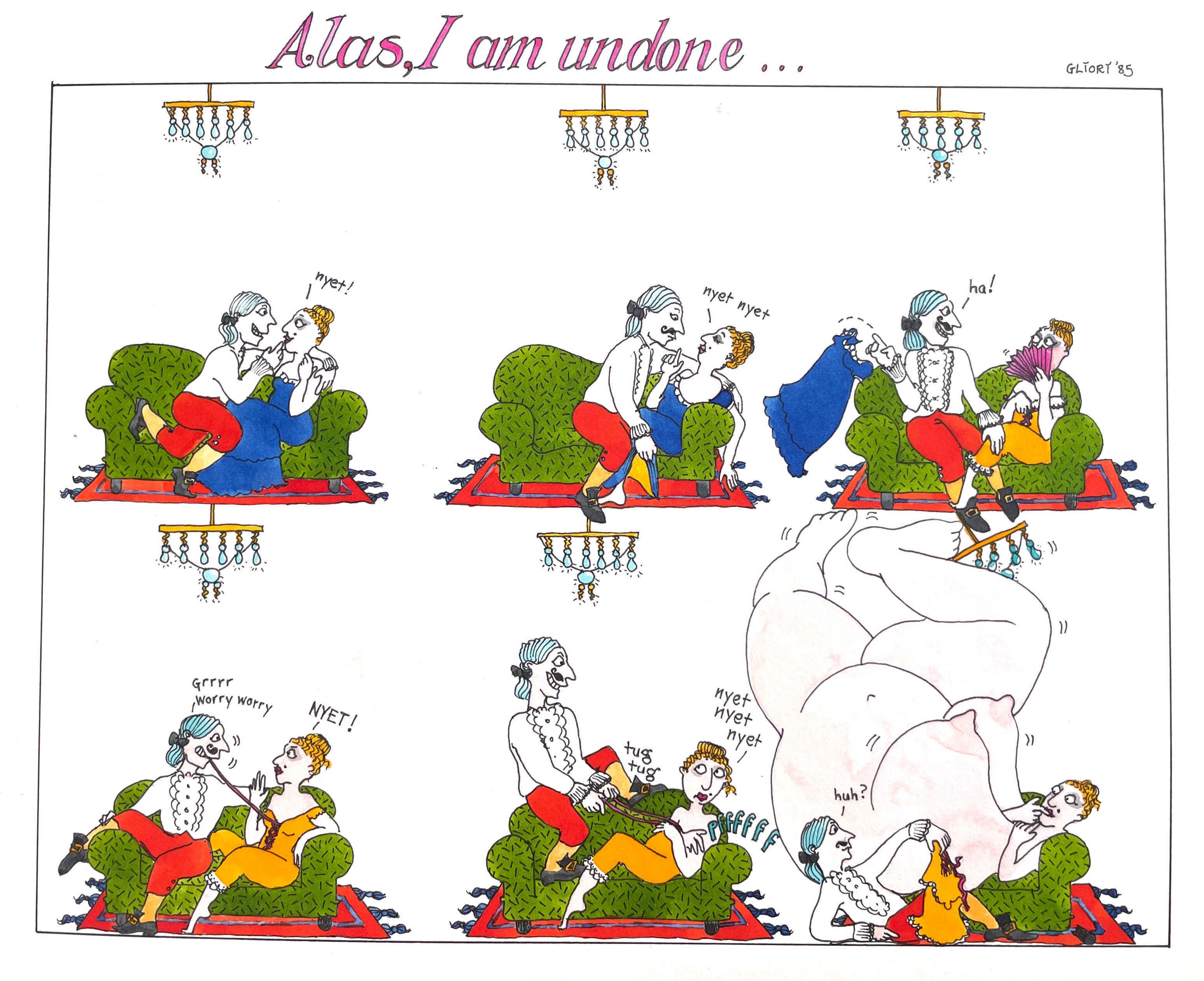
Oy. Semantics. Anyhoo. I pulled out the colour illustration above for a book I wrote, never-to-be-published, and immediately saw the Dad, the Amazing Magnetic Man as a role model for Luciano Strega-Borgia, aka the Dad in the Pure Deads who goes to prison, unjustly accused of murdering someone by the repulsive Marie Bain, cook to the Strega-Borgia family. But that is another story. Six of them, in fact. I will write about those books at some point, but for now, we’re here for the style or lack of.
When I left Art College in 1984 , I had, over five years of study, developed no personal and distinct style of illustration. This was a cause of much concern on my part. My fellow illustration students had managed to create readily identifiable illustration styles; to the extent that you knew who’d drawn what by the materials and methods they employed to make their artwork. This singularity of style was encouraged, mainly because it served to make an individual illustrator stand out from the crowd. Whereas my smorgasbord of styles and media, coloured pencil and line, line and wash, scraper board etc…there was no one thing that made it look as if all my efforts were made by my one hand. Where I was scattergun, my peers were focused.
It made self-promotion in a time before the internet ( yes, I am that old) very difficult. Short of making appointments with art directors and turning up in person with an outrageously heavy portfolio ( this was a time long before laptops or iPads, so everything was on paper or line board and thus, weighty) the only way to show one’s work to a wider audience was to photograph it on 35mm film, make A4 prints from the photos at vast expense and send those out into the world with a covering letter. In an envelope. With stamps.
Pause while we give thanks to certain aspects of tech for making the sharing of visual information so easy and so instant.
Now we ping it across. That was the stuff of pure science fiction back in the Eighties.
Anyhoo. That coloured pencil drawing of the amazing Magnetic ManDad, the Lion TamerMama and their little boy, Magnus ( who finds an Opum - a rare and tiny mythical being that resembles an eight-footed Psammead) for all its coloured pencil amateurishness - that caught the attention of an editor and led to my being published with Walker Books.
Whereas this black and white scraperboard Cook’s Alphabet…
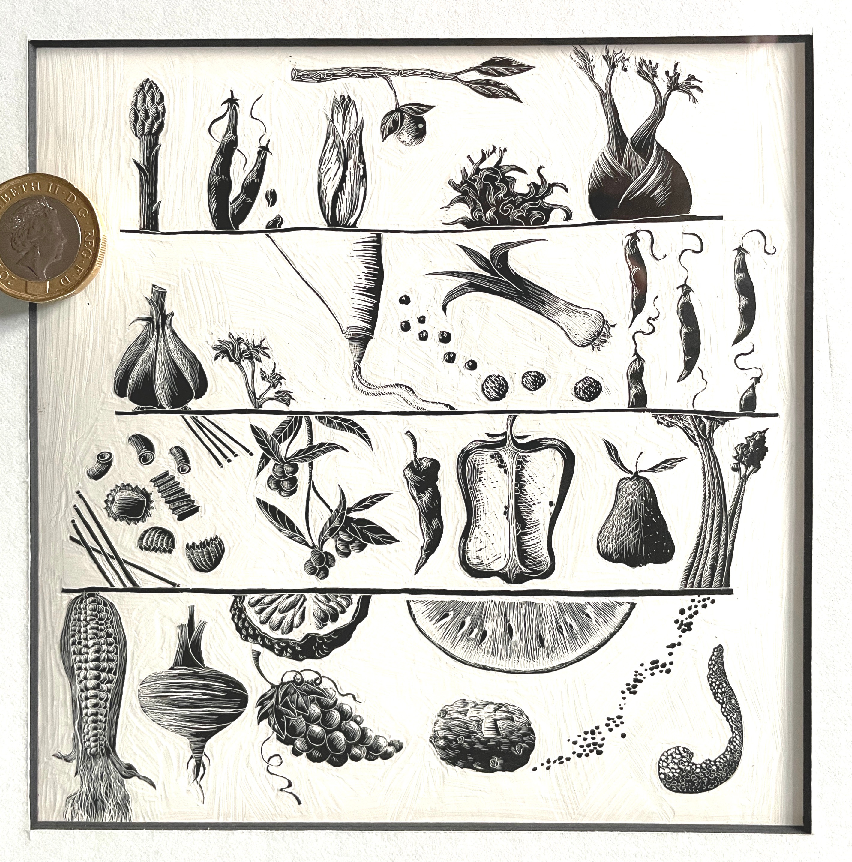
This eyeball-wrecking portfolio sample led to my being commissioned to make shedloads of similarly styled illustrations over a period of several years for a variety of advertising agencies and their famous clients. Note: my first book with Walker Books came several years after the years of advertising work.
Unlike the relatively leisurely pace of publishing deadlines, advertising work was very high-pressured and tended to either come by phone or fax. Remember those? I leased one for several years, and every time it sprang to life and vomited out a letter accompanied by drawings, I’d want to run down the street yelling - The future is here! Drawings transmitted by telephone? Truly we live in an age of miracles! The ad agency’s art director was invariably working to a ridiculous deadline and thus, so was I. I’d invariably be off the starter’s block and sprinting towards the deadline after being briefed at 4pm on a Friday with an agreed hand-in at 10.00 a.m on the following Monday. This feat of impossible completion entailed either driving the finished artwork into Edinburgh first thing Monday morning, or putting it on the late night London train by the long-discontinued Red Star service on Sunday night at 10.30 pm, both of which wrecked weekends and left me a hollowed-out shell for the following week. But a rich shell. It paid, at least to this recently-graduated illustrator, unimaginable sums which allowed me to pursue my dream of a real career in children’s publishing without recourse to a garret or a day job.
Unlike advertising, books and publishing were exactly where I wanted to be. Everything I drew , apart from the advertising work, every single thing began with the written word. I would read a sentence and immediately, an image would appear in my head. The trick was to get that image out and down on paper without my lack of technique getting in the way. That is a skill I’m still trying to perfect. The struggle is real, but at the same time, is foundational to my process and is one of the reasons I show up every day, tools in hand, attempting to get my signal out there. Attempting to communicate without words getting in the way.
Hand on heart, I didn’t really want to be banging out scraperboard illustrations for banks and insurance companies and distilleries. Moreover, I hadn’t the first idea of how to schedule my workflow so that I could actually have any time for rest or, sadly, creativity.
However, I wasn’t complaining. Far from it. This tsunami of advertising work was success, writ large. Straight out of Art School and I was making a living as an illustrator? Who’d’ve thunk it? Until… not only did I burn out, I crashed and burned spectacularly. All those all-nighters with only a pot of coffee and a hefty dram of Macallan to keep me awake. All those nights sandy-eyeballed and unutterably lonely with only the radio for company. Everyone except for me could see that this was a recipe for disaster.
I unravelled rapidly, alarming my family and ending up in such a reduced state (literally, because who has time to eat when deadlines are piling up?) that I couldn’t work for almost an entire year. Medicated into a near-zombie version of myself meant that my imagination became shrouded in the neural equivalent of loft insulation.
That numb grey fog-state continued until, for no clear reason, it slowly cleared and I emerged, older and definitely wiser. No more insane deadlines for this girl. A year after my unravelling, I began to reinhabit my imagination. The utter joy that I felt at being able to draw again almost - almost made up for my year in the wasteland. I had no money other than the government’s Thatcher-era single parent benefit, my partner had upped and gone but I was back behind the tiller. Captain of my little foolish ship. And best of all - I was able to make whatever art I damn well pleased. Stuff like the never to see the light of day Magnus’s Opum ( the amazing magnetic man and family) or illustrations for The Hitchhiker’s Guide, or cartoons, just because I felt like it.
But back to style. The idea that to succeed we need to be readily recognisable, to be a ‘brand’, essentially to shoehorn our miraculous creative energy into one single box? Ludicrous. It’s you that is recognisable. The authentic you, not some pimped-for-the-socials version of you. It’s you, not your technique, not your medium of choice, not your carefully curated lifestyle photos you sling up there for the world wide web’s grubby little fingers to swipe across.
You. You are enough.
Here’s an analogy. In order to present the most professional version of yourself ( your brand/style) you’re encouraged to dress for success. Shoes you can hardly run in, shoes that constrict your feet to the extent that every step hurts, clothes that flatter but are made of such materials that you hardly dare expose them to the dangers of daily life for fear of slittering gravy/coffee/red wine across their precious and dry-clean-only surfaces. Hair that requires chemical restraint to present a glossy, coiffed appearance, or different chemicals to imitate some fictitious version of a tousled, windswept look. Perfume, aftershave, body spray applied in sufficient quantities to mask the fact that you are human. A mode of dress that not only takes unconscionable ages to put together, it’s also one that you can’t forget about while engaged in the pursuit of success. Clothes that demand your attention ; tweaking, tugging, loosening, tightening, hair that requires repeatedly tucking behind your ears and constantly touching. There you are, trying to keep your thoughts focused on the talk you’re giving, the powerpoint, the interview and instead, all you can think about is how much those pointy shoes hurt or how the waistband of your trousers is mangling your midsection.
In short, your pursuit of some externally validated style is getting in the way of what you’re doing. Instead of simply turning up on time, wearing clean and comfortable clothes, bringing all your knowledge and creativity, ready to demonstrate that you have a unique gift to share, you turn up and you’re barely present because your focus is mostly elsewhere.
Illustration style is similar. Just show up at the sketchbook, the drawing board, the ipad, the canvas. Turn up on time with the pictures inside your head that only you can see, and use whatever you need to get those pictures out so that we can all enjoy your unique view of the world between your ears. Draw with whatever comes to hand, but just do you.
Just do you.
In essence, you’re trying to get a signal out. It doesn’t matter what you make that signal with ; a stick, a nib, a digital brush, cut out paper, wool, gold leaf; it doesn’t matter, what matters is what you’re trying to say, in your voice, with all your human heart.
Oh blimey o riley... or however you spell that. It's taken me until today to find your Saturday post... Substack confuses my v small brain by suddenly vanishing the one and only posts I want to read!
But now I've found this... WOOOOOP! So important. Wishing all students (and practitioners) (and me) will read, learn and inwardly digest your thoughts. Fab, as always.
👏🏻🌟👏🏻🌟👏🏻🌟👏🏻❤️❤️❤️
Loved this Debi, thanks for your openness. I have been trying really hard to ‘just do me’ for years and it actually seems to be getting me somewhere I really want to be, so thank you for the encouragement.
Two of my kids went to that nursery in the last cohorts before it moved site, it was a great nursery.